Issue 108
Grid DevTools are coming to Chrome, feature comparison tables, lazy loading images and a little bit of an animation theme.
News
Issue 108
On Friday I fly to Chicago for the start of a very busy conference season. My site is up to date with where I'm speaking and what I'm speaking about. I hope to see some of you on the road!
I like to mention other aspects of CSS and design in this newsletter, as layout doesn't happen all alone. So it isn't surprising to include animation every so often as I have this week, with an article on A List Apart that describes how to include animation in a design system. I'd also like to give a shoutout to fellow A Book Apart author, Rachel Nabors. Her book Animation at Work is out today. I read a preview copy and it really is a worthwhile addition to your library.
Rachel Andrew, CSS Layout News
Chromium Blog: Chrome 61 Beta: JavaScript modules, Payment Request API on desktop, Web Share API, and WebUSB
Details of features in Chrome 61 Beta which includes the scroll-behavior CSS property for smooth scrolling.
728062 - DevTools: Add CSS grid highlighter
If you have Chrome Canary you can check out the Grid Highlighter now part of Chrome DevTools. It isn't quite to the functionality provided by the Firefox Grid Highlighter yet, but it is great to see Grid support landing in more browser DevTools.
Learn
Here's a Super Quick Way to Try out CSS Grid | Jen Simmons
Some quick exercises to get started with learning CSS Grid - from Jen Simmons.
Integrating Animation into a Design System · An A List Apart Article
Animation is very much becoming standard in interfaces, in this article Alla explains how to integrate animation into your design system in order to maintain a cohesive system.
Designing The Perfect Feature Comparison Table – Smashing Magazine
Another extensive breakdown of a design pattern from Vitaly. This time he takes a look at feature comparison tables.
Lazy loading images using Intersection Observer | Dean Hume
Using Intersection Observer when lazy loading images, to avoid the jank that can occur as re-layout happens when images load in.
Interesting
[css-grid] fit-content() vs 'stretch' alignment · Issue #1732 · w3c/csswg-drafts
What we initially thought was a simple issue raised over on my GridBugs repo, turned out to be a bit more involved (don't they always!?)
If you have thoughts to add with regard to whether fit-content should stretch or not, comment on the issue.
Our Sponsor

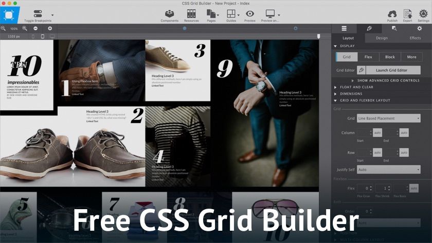
Learn, prototype and get creative
CSS Grid is powerful and no doubt the layout method of the future. CCS Grid might take a little to get used to though. That's why we created Grid Builder. And so everybody can learn and work with this exciting new technology, we made it free!
As you can see in the screenshot above, we totally got creative while toying around. Just hop over to get the app, play with the showcases or create something from the start. Then let us know what you think!
You are also welcome to hang around a bit, look at demos and read up on Grid. See ya there!
CSS Layout News Newsletter
Join the newsletter to receive the latest updates in your inbox.
