Issue 156
Browser Grid updates, typesetting, web components, WebP, and the fr unit
News
Issue 156
The British heatwave, and that of many other places, continues. I'm heading to Washington DC on Friday for An Event Apart and looking forward for once to hotel air conditioning!
A varied collection of links today as I look slightly outside of layout and to type, new image formats and web components! A lot of the things I add here are based on the things I'm currently interested in, or needing to research for one reason or another.
I've currently no sponsors for the email, so if you would like to get your product or service in front of over 9000 CSS-loving folk, take a look and drop me a line.
Rachel Andrew, CSS Layout News
Update behavior of CSS Grid Layout percentage row tracks and gutters - Chrome Platform Status
A change that might be of interest for anyone using CSS Grid Layout with row tracks or gaps set in percentages. These have been changed to be more symmetric in the spec, and Firefox has already updated to make them so. If you have used percentages in this way you might like to keep an eye on this coming update in Chrome.
A Book Apart, Flexible Typesetting
I very much feel that it will be the new control we have over type, coupled with our better layout methods in CSS, that will really change the way our websites look. As such, and despite being no typographer, I've been taking a growing interest in typography and typesetting. This book from Tim Brown couldn't come at a better time, and it is available to buy from today.
Learn
Converting Images To WebP — Smashing Magazine
WebP promises us the ability to have beautiful yet performant images on our sites. In this excerpt from The WebP Manual (released today!), Jeremy Wagner explains how to convert images to the WebP format.
Fractional. — Ethan Marcotte
"If I find myself doing some contextual layout math, I’ll ask myself if there’s a simpler way. And more often than not, thanks to fr, I’ll find the answer is yes."
Unlocking the Power of CSS Grid Layout
I spoke at Scotland CSS last week although had to make an unscheduled early getaway due to some sad news at home. My slides can be found here. I'm really sorry I wasn't able to hang around and chat to everyone.
(57) CSSconf EU 2018 | Chen Hui Jing: The Web Is Not Just Left-to-Right - YouTube
This talk traces the parallel history of western and eastern typography from handwriting to the internet age, setting the context for how the web is a brand new medium for typesetting. CSS allows us to implement advanced typographic features and multi-directional layouts, that not only benefits internationalisation, but opens up a myriad of options for creative and interesting layouts in general as well.
The Holy Grail Of Reusable Components: Custom Elements, Shadow DOM, And NPM — Smashing Magazine
We're going to be talking more and more about web components, and this tutorial explains how to create a simple reusable component outside of any frameworks and introduces the Shadow DOM, and how to publish the component to NPM. A nice intro to the subject.
Interesting
CodePen - Swiss Layout
A poster layout using CSS Grid and Writing Modes by Sarah Drasner.
Our Sponsor

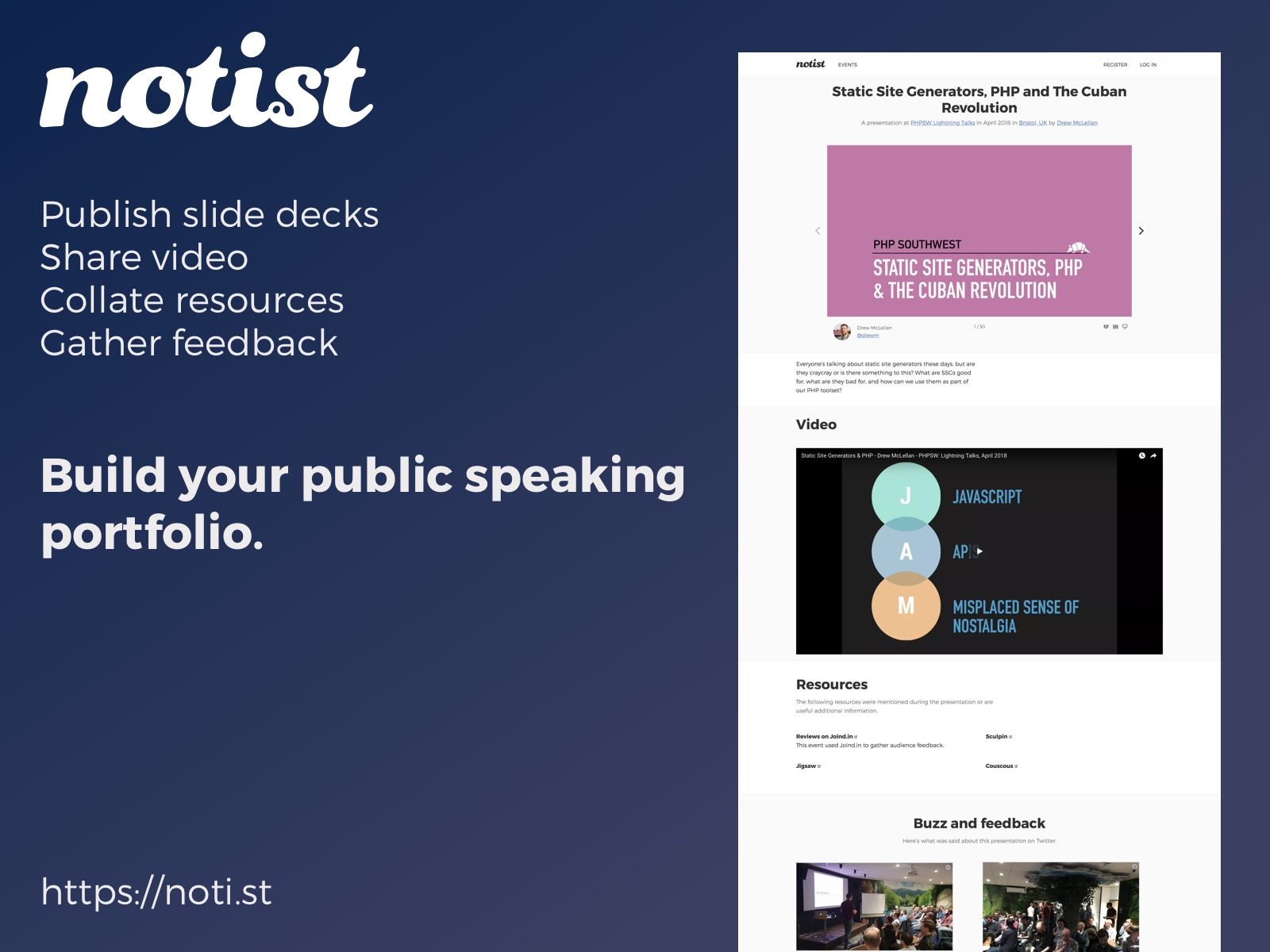
More than just slides! Create your permanent public speaking portfolio with Notist
Whether you speak occasionally at local meet up groups, or frequently take the stage at big design conferences, Notist is the place to build your public speaking portfolio.
You can share your slides, but also add video, pull in tweets, and build up lists of links and resources for attendees to reference to. Over time you can build up a solid resource of all your speaking engagements.
If you ever hook up to a projector, you should get hooked up with Notist.
CSS Layout News Newsletter
Join the newsletter to receive the latest updates in your inbox.
