Issue 191
Making Sense of the New CSS Video, a useful a11y tool, responsive images, and blurred borders
News
Issue 191
Heading towards the end of the first quarter of the year, and I'm about to dive into conference season proper with a number of talks and workshops on CSS Layout related subjects. You can follow along via my speaker profile on Notist which is also the place to find my slides and video from previous events.
I would love to find some more sponsors for this email. It gets expensive to send email to almost 10,000 people every week! So if you are a company who is interested in sponsoring a week then take a look at the sponsorship page and get in touch.
Rachel Andrew, CSS Layout News
Learn
“Fit For Purpose: Making Sense of the New CSS” by Eric Meyer
If 2017 was the year of new CSS capabilities, 2018 was the year of trying to figure out what to do with them all. When should boxes flex, and when should they be gridded? What are the best ways to manage your team’s approach to all these new powers? What’s ready for production, and what’s useful in the shop?
This is a fantastic talk, which I was lucky enough to see a few times in person at An Event Apart, and you can now watch it too in this video,
Planning for Responsive Images | CSS-Tricks
A guide to making the right selection out of the options you have for responsive images in order to provide the best experience to your visitors.
Blurred Borders in CSS | CSS-Tricks
Making blurred borders on an image, lots of interesting CSS knowledge wrapped up in this.
All you need to know about hyphenation in CSS | Clagnut by Richard Rutter
Not layout, but I think the crossover between layout and typography nerds is probably fairly strong, and I love in-depth walkthroughs like this.
Interesting
Accessibility Insights
This is great, and immediately picked up some easy things I could fix on one of my projects. While an automated tool can't catch everything, things like color contrast can be, and this tool is a great initial check.
Also take a look at the tab stops tool, which is a brilliant way to make sure you haven't accidentally disconnected the source and visual order of your document when using grid and flexbox.
Our Sponsor

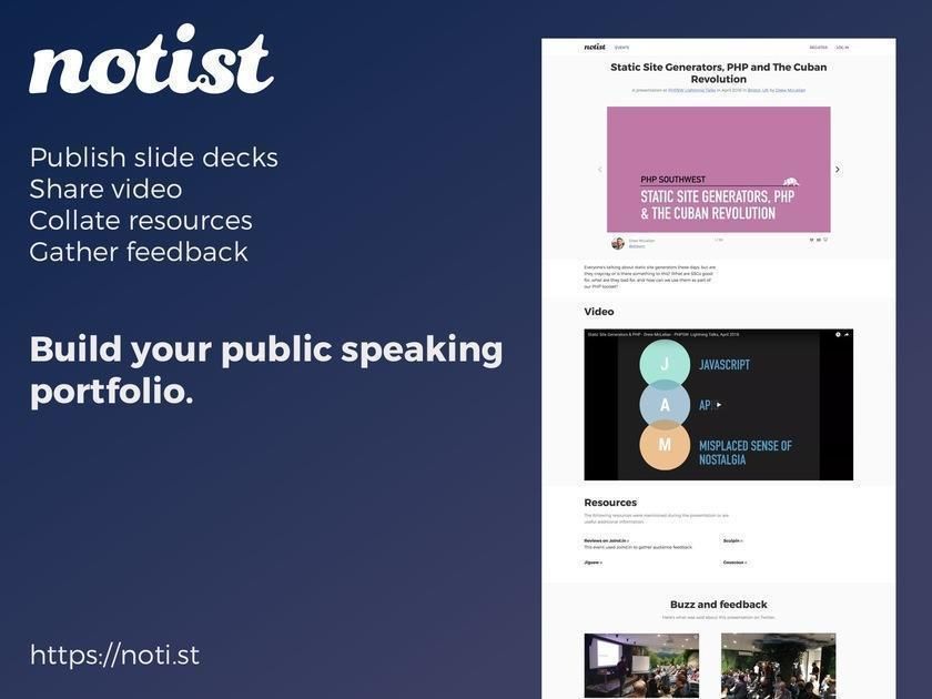
Slidesharing and much more. Create your own speaker portfolio with Notist.
Whether you speak occasionally at local meet up groups, or frequently take the stage at big design conferences, Notist is the place to build your public speaking portfolio.
You can share your slides, but also promote upcoming events, add video, pull in tweets, and build up lists of links and resources for attendees to reference to. Over time you can build up a solid resource of all your speaking engagements.
If you ever hook up to a projector, you should get hooked up with Notist.
CSS Layout News Newsletter
Join the newsletter to receive the latest updates in your inbox.
