Issue 46
Responsive Design, Safari 10 news, infinite scrolling and pixel density.
News
Issue 46
Spring conference season is winding down and I soon get a little break from travel. Tomorrow I'm heading to HTML Day and CSS Day in Amsterdam. Looking forward to two days focussed on HTML and CSS.
Later this year I'm on the road again, and will be speaking at An Event Apart in Chicago and Orlando. There is something of an An Event Apart theme to this week. They are sponsoring this edition of CSS Layout News (thank you!) and I've also included an excellent video recorded at AEA Austin.
Rachel Andrew, CSS Layout News
Prerelease Notes: What's New in Safari 10.0
The release notes are up for the upcoming Safari 10 release. Of interest in layout is the support for clipping with SVG paths, new supported values for border-image and break-after, break-before, and break-inside CSS properties are now supported.
The other news is that auto-playing videos is also supported on iOS. If the video has no audio track it can begin playing automatically when the page loads.
Learn
Laziness in the Time of Responsive Design by Ethan Marcotte
Here is a fantastic video recorded at An Event Apart, Austin. Watch Ethan Marcotte explain how a variety of complex looking responsive designs can be implemented in far simpler ways than you might think.
Mobile-first CSS — Medium
"Mobile-first CSS has to do with how you architect your code and media queries, as well as how browsers parse your CSS."
A useful primer on authoring CSS.
Quick Tip: How z-index and Auto Margins Work in Flexbox
A short post with examples on using z-index and auto margins with Flexbox.
Infinite Scrolling Best Practices — UX Planet
If you want to implement infinite scrolling, here are some helpful tips on how to do it without causing a problem for some of your users.
Sticky Footer, Five Ways | CSS-Tricks
A variety of different ways to create a sticky footer - one that sticks to the bottom of the browser window if the content is short.
Interesting
#148: Laying Things Out (HTML & Flexbox) with Dee Gill | CSS-Tricks
A "pairing screencast" where Chris Coyier works with Dee Gill on the CSS to build some navigation from a design mockup. If you like watching how things are built, you'll enjoy this.
Pixel Density, Demystified — Medium
An in-depth and useful article explaining pixel density, and how high ppi/dpi screens work.
CodePen example: Using flexbox to make responsive widgets without media queries.
Something I've been realising in my own work recently is how using Flexbox often means we can do without the media queries. Here are some examples of exactly how this works from Mark Stickling on CodePen.
Our Sponsor
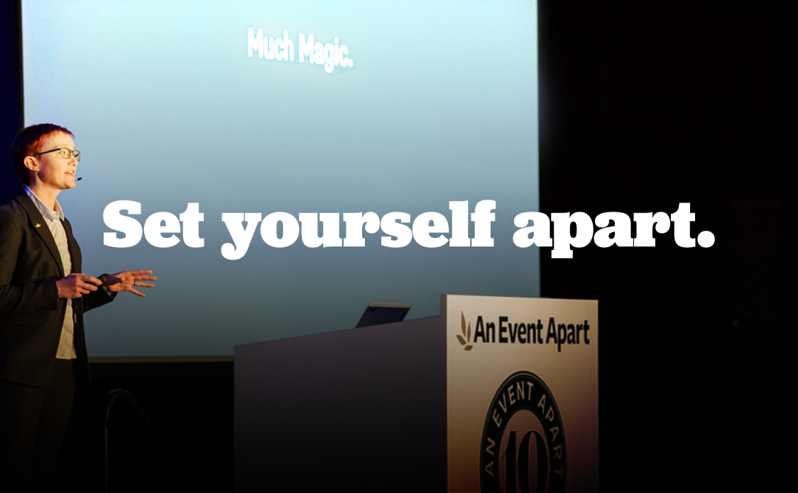
An Event Apart
We work hard to bring together the best minds in the field—people just like you—to dive deep into doing our jobs better and talk about what’s coming next. An Event Apart is three days of intense focus on digital design, UX, and more. If you care about creating the best possible experiences for the people who use your work, and crave concentrated time to level up your skills in the company of your peers, join us and save $100!
CSS Layout News Newsletter
Join the newsletter to receive the latest updates in your inbox.